Create Smoke Text
May 7, 2009A big thing that you see in graphic design at the moment is the use of smoke stphotography, these photos look really good but look a lot better when you mess about with them in Photoshop. Here we’ll be mixing type and a smoke image to create a really nice abstract wallpaper. This is just a quick tutorial but hopefully you’ll learn some new techniques so give it a go.
INTRODUCTION
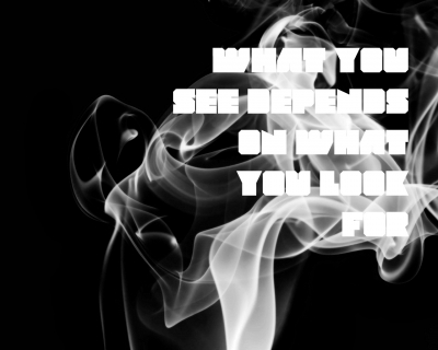
I got the idea for this tutorial from a font preview image here. Check out what we’ll be learning to make below.


STEP 1
Create a new document with dimensions; 1280×1020px and a resolution of 72px/in. Create a new layer. Change the foreground color to black then go Edit>Fill and fill it with the foreground color, a quicker way to do this is to hit alt+backspace. Paste your image into the document, the one I used can be found here. Select the move tool then move this layer so you have it looking like the image below.


STEP 2
In the layer panel click the adjustment layers button and select black & white, now just change the red value to 150% and leave the rest. Now add another adjustment layer, this time the invert one. Now you should have something that resembles the image below, notice how the smoke looks a bit nicer.


STEP 3
Select the two adjustment layers and the smoke layer by holding Ctrl and clicking on them in the layers panel. Now right click on one of the selected layers then select convert to smart object, or if that option isn’t there then just select merge layers. The advantage of using smart objects over just merging is that you could go back and edit the smoke here or the black & white values but I think only CS3 and up support smart objects. Select the text tool then change the font to a block style font, the one I used can be downloaded here, and a size of about 100pt. Now type your text, here I wrote a quick quote I remembered and used the color white. Move this layer so that your image resembles the one shown below.

STEP 4
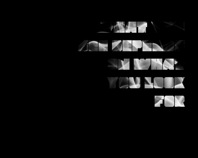
Hold Ctrl and click on the text layer to make a selection, then selct the smoke layer. Now add a layer mask to this layer by clicking the layer mask button in the layers panel. Hit Ctr+D to remove the selection then hide the text layer.

STEP 5
Right click on the smoke layer in the layer panel and select duplicate layer, you can also just hit Ctrl+J to duplicate a layer, its a bit quicker. Select the layer mask on the new smoke layer and invert it by hitting Ctrl+I. You’ll notice you’re image looks like it did a few steps back but we’ll sort that out.


STEP 6
Select the new smoke layer then make a layer group by clicking the wee folder icon in layers panel then drag the newer smoke layer onto the layer group to put it inside then change the blend mode of the layer group to screen in the layers panel. Now add a layer mask to this layer group by clicking the layer mask button in the layers panel. Select the brush tool then right click in the document to open the brush settings panel, you can access this from the main toolbar but this way is faster. Change the brush to a soft round brush with a diameter of about 240px but you may have to keep changing the diameter. Change the foreground color to black then select the layer mask you just made. Select the brush tool then put on some brush strokes over the text and you”l notice this will get rid of the smoke around the text, you do still want to keep some of the smoke flowing into the text so try experimenting by changing the opacity of the brush in the main toolbar. If you got rid of a bit too much smoke then just change the foreground color to white and brush then this will unhide the smoke. Keep at it until you have something similar to the image below.


STEP 7
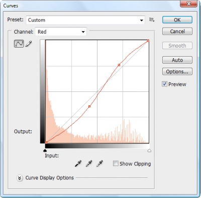
Now add a curves adjustment layer at the very top of the layer stack then change the channel in this box to red and click and drag on parts of the curve until you get something similar. Feel free to experiment with the other channels, I just used red as an example.

STEP 8
You’ll notice that a few of the words might be impossible to read so if this is the case then you can lighten the background a bit. Remember that layer we created in the first step and filled black well select that and lower the opacity, this will lighten the background a bit, you shouldn’t need to lower it a lot, I think I put it to 98% but I quite liked it being almost unreadable.


CONCLUSION
Hopefully you’ve learned a few new techniques that you can apply to some projects. A good idea would be to go back and repeat this tutorial but use a totally different image, not a smoke one. Let me know how you get get on.
